Case Study
Reimagine the check-in workflow at the walk-in clinics and ER system, to improve patient satisfaction.
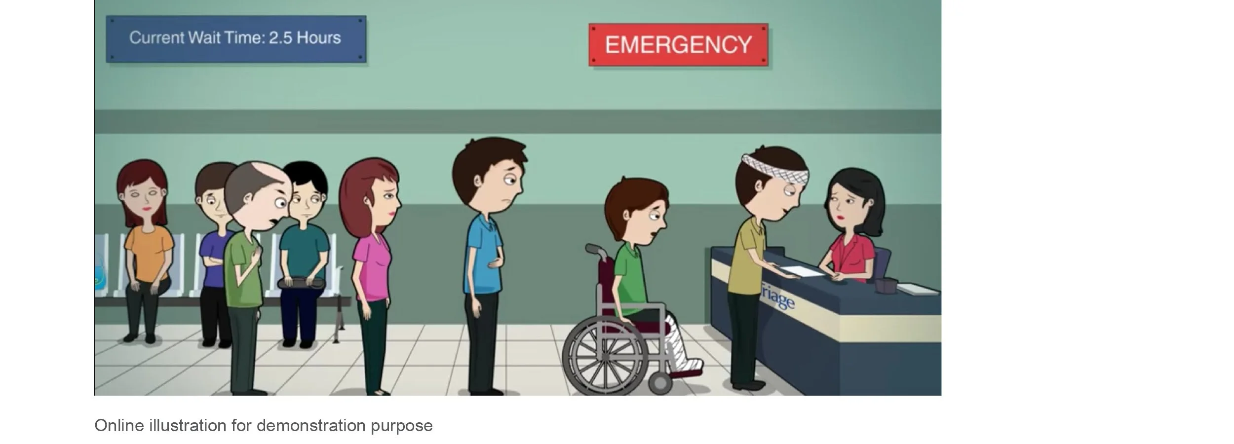
Have you ever been to a walk-in clinic, filling in the endless form when you are in pain?
The patient check-in process is a very important and absolutely necessary step for the facility and the physician to gain a clear acknowledgment of the patient so that they can perform their duty correctly and efficiently. However, the process is not always delightful to the participate, especially visitors are not in their best condition when they are in the clinic.
How might we create an efficient and friendly user experience for the patient, to minimize the check-in time and get to see the doctor as quickly as possible?
Research
I wanted to learn more about the experiences of the people who visit ER, and what is their feeling about the current process. My four main research questions were:
How do people normally seek help when getting sick?
What are the currently existing tools built to help?
How is the current system serves the patient?
What are the current experiences people are getting?
My primary and secondary research consisted of interviewing with white-collar workers, as well as looking into what current application and platform are used today for health experience.
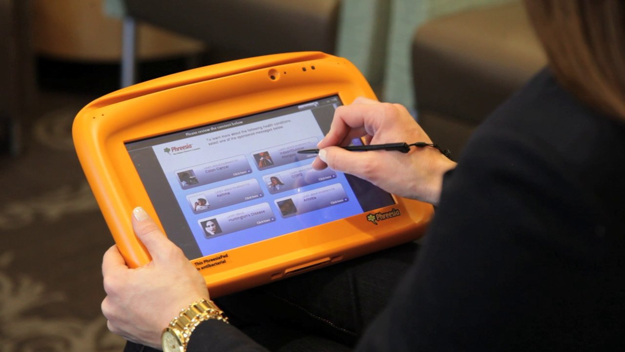
Examples of existing checkin method at medical facilitiesCompetitive analysis
I performed a competitive analysis of the different medical platforms that exist today to identify gaps and must-have features for this matter.
User research
These findings provide me a valuable data to redesign the emergency room check-in process, to be more humanized and empathetic.
Personas
Before jumping into the design, I built personas to help me keep the ideal userbase in mind.
Ideation
I brainstormed and came up with a potential solution, both ration and wild, to provide a humanized and empathetic process for the patient. I sketched out the idea and created storyboards to better communicate the scenarios.
Prototype
I sketched out the flow first to identify the keyframe. Then I created a clickable prototype to capture the flow, and interacted as a user making through the process.
Usability testing
I took the prototype to usability testing. With the help of UT, I was able to learn and observe how users engage with the design. I documented the results and got the quantitative data from users, such as time to completion, and response to the flow. I also found that the pain scale bars are the most popular feature on this platform.
Future proposals
Taking the finding from user expectations, competitive landscape, and feature prioritization into a more realistic and practical design. Think about how color and layout create a hierarchy for a better user experience, and keep the concision, promptness, and clarity of the flow.
I believe my solution solves many of the shortcomings of the existing urgent care workflow, for patient satisfaction, to be more humanized, empathetic, and illness friendly. I can see this solution not only apply to urgent care but also develop as a smart home platform that can be used as a home care system.


